
 |
Delta Snake Review: Nov. 16, 2026
Topics: 2027 projects, creating the hybrid Quitturz cover
2027 is only six weeks away and I’ve settled most of the details for the planned projects.
“Queen Khleow” is live and the planning for a webcomic version has begun. I haven’t decided if it will be treated as a graphic novel yet but the level of detail in the characters and story is ideal for that format.
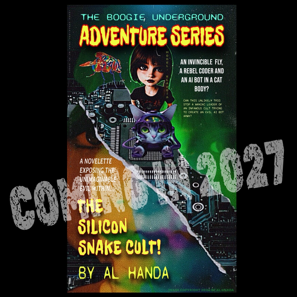
The promotion for “The Boogie Underground Adventure Series” has begun with a cover reveal and this project will be sort of like the others; a text novelette but the webcomic version will be run online weekly (and then compiled into a graphic novel).
This series is specifically written to be the basis of a comic strip. As you can tell from the cover, it is a parody of the old pulp crime and mystery magazines. The book and strip will be a tribute to the old Jay Ward cartoons and early MAD Magazine.
The Quitturz is on schedule for a February 2027 drop. The novelette is basically set and I’ll begin editing the final draft in December. The graphic novel version is about ⅓ done though I may go back and redraw some of the panels and add some visual detail that’s not in the book.
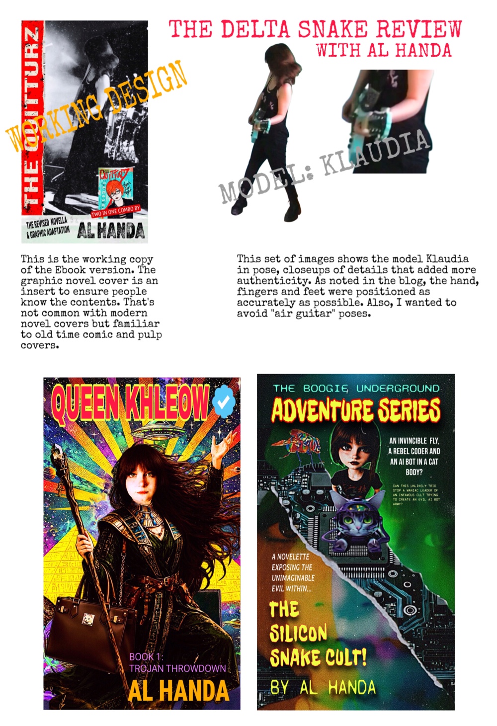
The attached demo of the projected Quitturz novelette shows the illustration, which is a photo of the model Klaudia, who spent a lot of time making sure she was handling the guitar correctly right down to how her fingers were positioned with a pick and on the neck.
The cover photo is a great action shot that has a lot of energy radiating from it, so I’m going to avoid framing it in an overly “professional” layout. I want the final version to look like the 1977 hand bills at the Mabuhay Gardens and elsewhere.
The stress was on avoiding hammy air guitar poses. Those are common for PR photos but I wanted a realistic shot that showed the actual energy of playing a guitar under hot lights at high volume in front of an often hostile crowd. A lot of people were still making up their minds about punk in 1977.
The shoot was done in video and I went through it frame by frame and found a good action shot. I then cut it out and pasted it into a minimal stage graphic with part of a drum set. The image was then filtered to look like a 70s era photocopy/polaroid photo.
I was originally going to make it look like an actual 70s Polaroid but decided to go with a traditional layout for the text. The Quitturz logo shown is a working image, I’m leaning towards drawing it in by hand like with the comic cover.
In the case of 1977 punk graphics, it started off very lo-fi and had a rough anarchic energy that changed very quickly once the major labels, media and professional artists got into the act. Nowadays, in the media, it seems like almost every 70s punk wore a mohawk and black leather jacket covered with dozens of studs with fonts that are more post punk or goth.
Which is understandable; no one‘s gonna pay an artist to draw in fonts with a sharpie pen or use cut and paste graphics. However, this project will have a late 70s look so the less polish the better. In fact, the real challenge will be to ignore all of my graphic experience and be true to the era.
Al Handa
#punk #webcomic #pulpfiction #madmagazine #sanfrancisco
 |

