 |
Delta Snake Review: Sept. 21
70s Punk Poster and Cover Graphics - Part 1
Most late 70s punk posters and covers were essentially collages that looked slapdash but were more creative than it might have looked to the average person. The final work was generally done using a copier but in many cases as a “print ready” layout to a printer.
In other words, these punk posters were created by artists who had the imagination to visualize lo-fi graphic designs (dare I say, “scraped” from ransom notes, collages, pop art, etc) and create print ready layouts for wherever reproduction technology was available (or more specifically, affordable).
I was aware of print ready layouts for the offset printing process because in high school I was the school newspaper editor for two years; which is another way of saying, was like a retail store manager, who was the one willing to stay after school and finish most of the layouts.
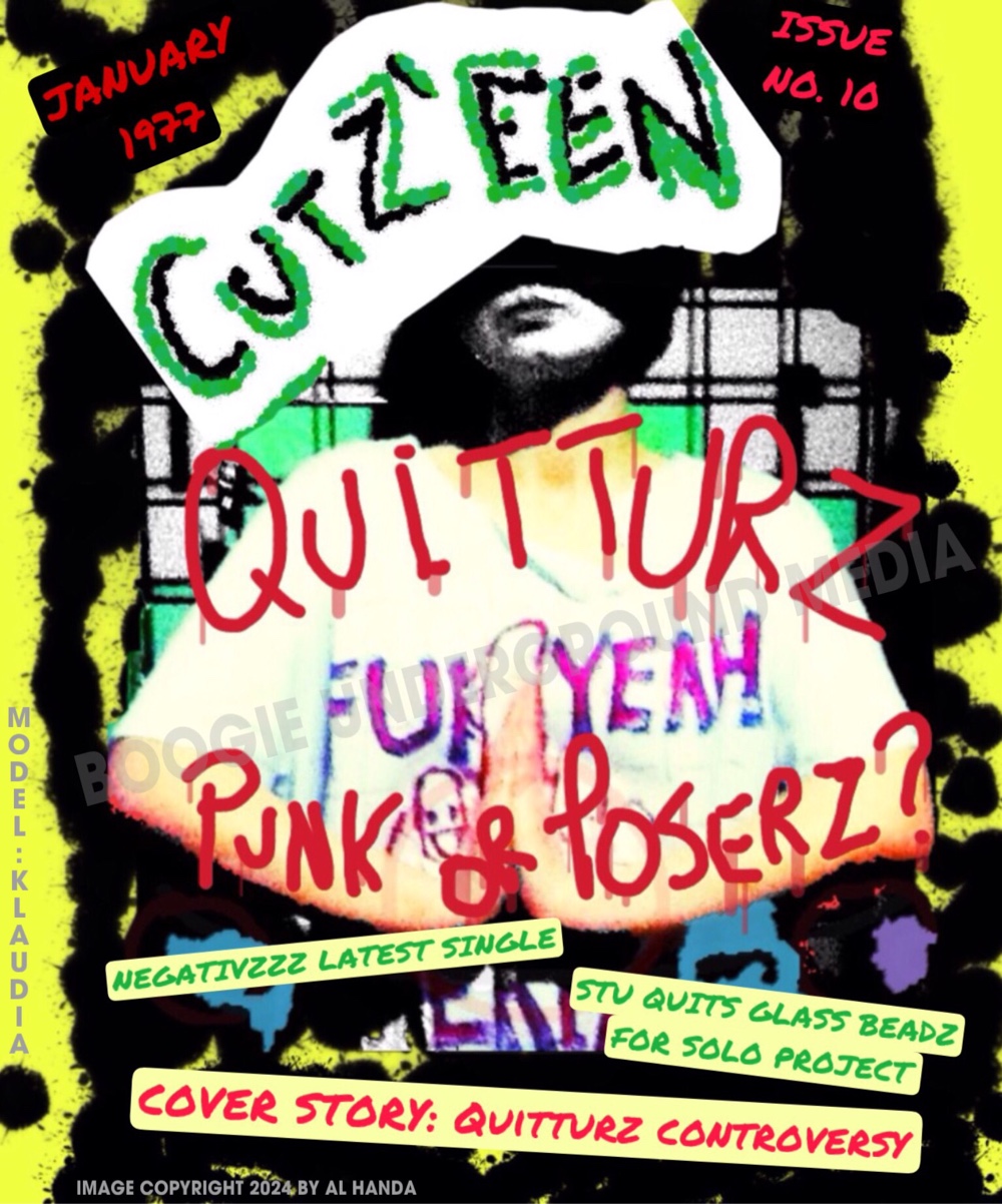
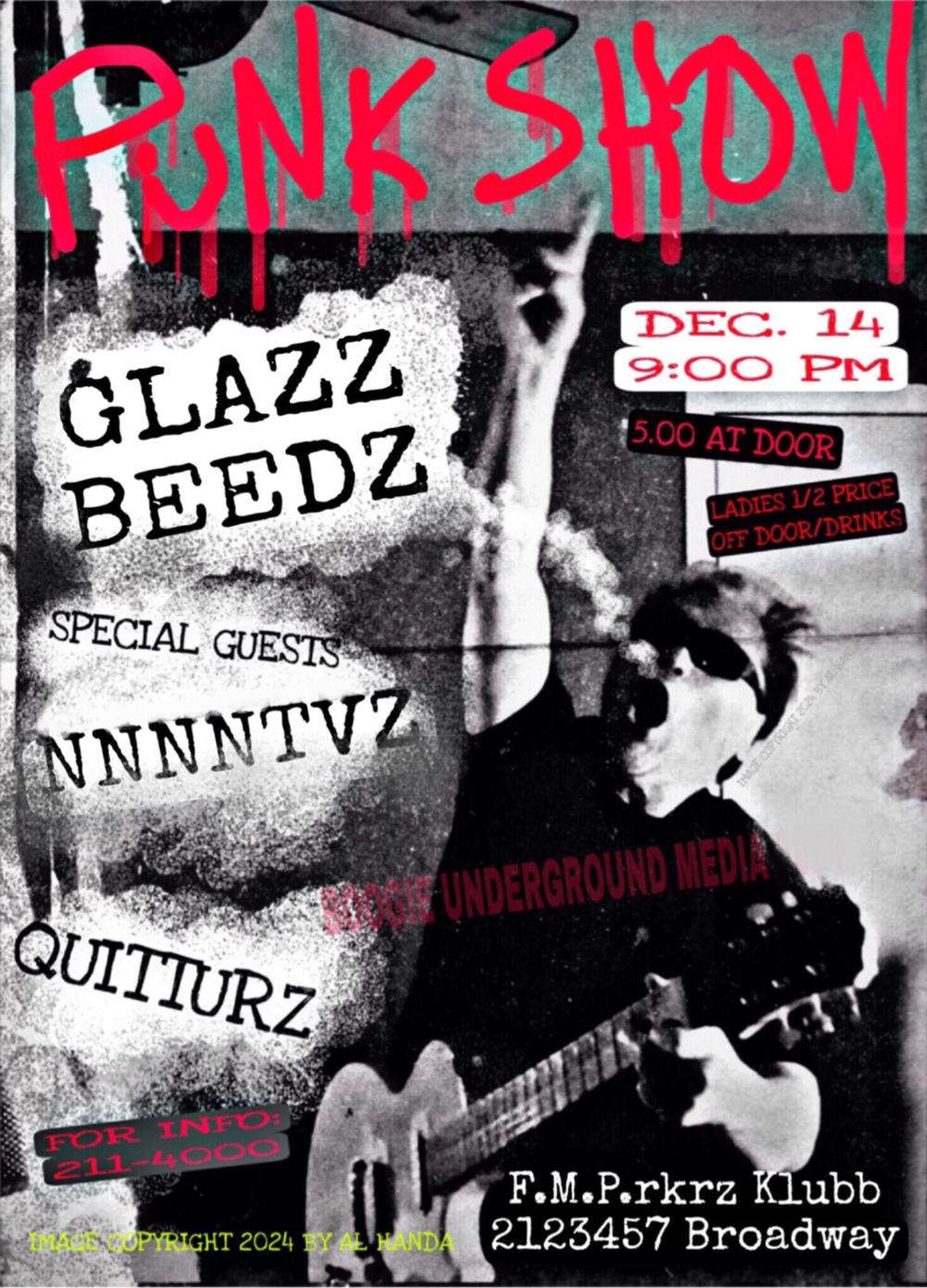
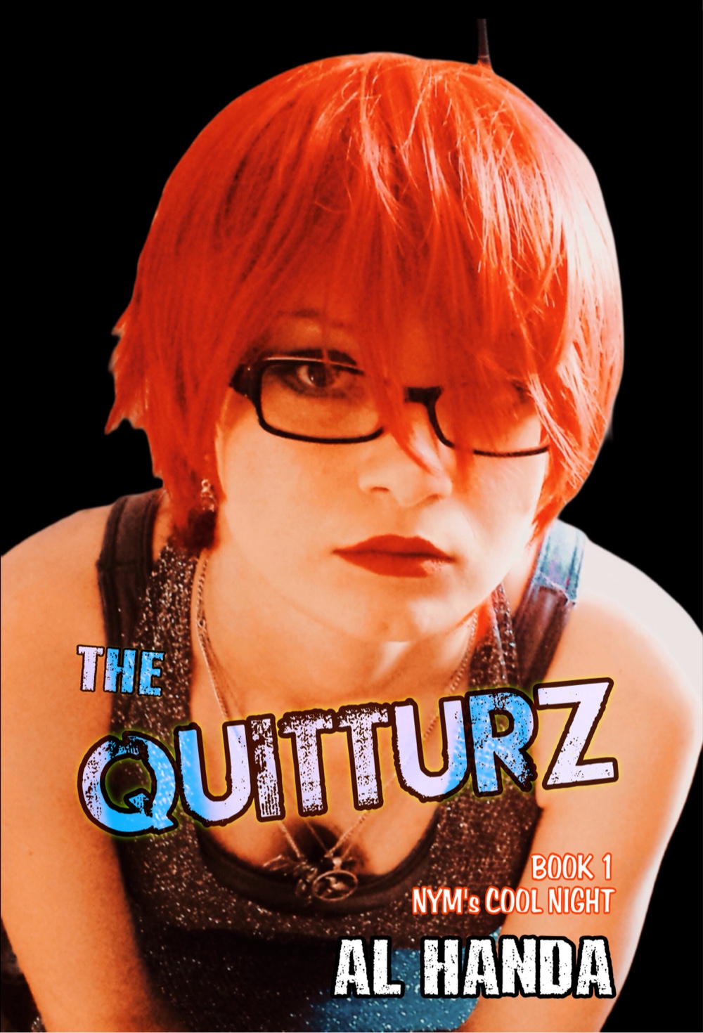
There were fictitious punk magazine covers and concert posters in The Quitturz Book 1: Nym’s Cool Night and although designed on digital programs, I was careful to do it pretty much the same way I would’ve done it in the 70s with a cut and paste style combination of hand drawn, offset and copy machine, lettering, and illustrations.
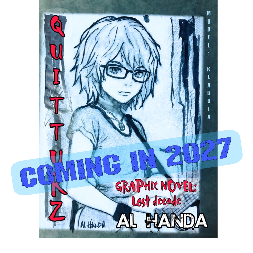
There are two of the illustrations (in addition to a book promo drawing) and will describe the process which would have been done by hand in the punk era.
 |
 |
The colorful one is probably the least realistic in terms of street art. It’s a magazine cover by a publication that could afford a color cover using offset printing (aka offset lithography) and staff skilled in creating layouts that were “print ready” for the process.
The coloring process would have been more complex; the artist would have used layers like a modern digital application except those would have been tracing paper (or clear film if you were a well off publication) with the entities for each color on its own sheet. In other words, all green shapes in one sheet, red lettering and stuff on another and so on.
That wasn’t hard to do in the 70s because much of the ink work for comic strips and other types of illustrations were done on tracing paper. It was a common skill.
Somebody, or the artist, would create a pencil sketch, and then another person would come in and put in the ink lines on tracing paper and the additional layers for color, etc. The artist would often do all these stages, of course, but in big-time strips, there were often people who did the lettering, inking, etc.
The club concert poster was simpler; I simply reproduced a cutout of a photo of a punk rocker (in this case, me) and digitally pasted that into a white sheet and then added the mainly freehand looking lettering.
I took artistic liberty with the top caption which was done in a spray paint font, which I probably would’ve done in a commercial setting if working on a larger commercial poster size layout with an airbrush.
The first Quitturz book has illustrations that are a small historical survey of 70s punk and rock graphics from magazine covers to a fake satirical county fair poster.
In part 2, I’ll show the pieces of a punk poster being made for the graphic novel which I’m actually going to print out and cut and paste together for authenticity (and for fun). I’ll also talk a bit about why punks used the DIY approach.
Al Handa
Sept. 22, 2026
#punk #graphicnovel #manga #alternative #illustration
| ||||||