The Delta Snake Review

The Delta Snake Review

Translate

Showing posts with label manga. Show all posts

Tuesday, September 29, 2026

Delta Snake Review: Comic update, Parts 1-3 of 70s Punk Flyer Demo and future features.


Delta Snake Review: Sept. 29, 2026


Topics: Comic update, Parts 1-3 of 70s Punk Flyer Demo and future features.


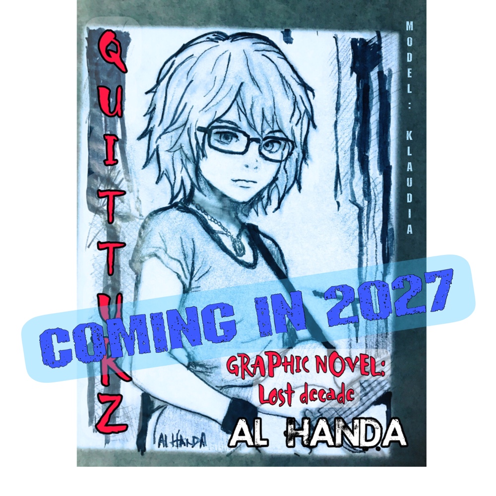
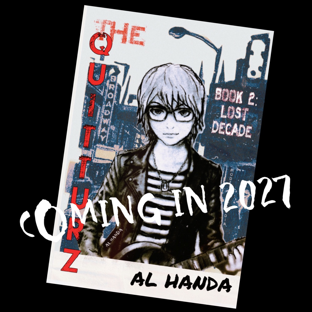
I’m approaching this as if the Quitturz book 2 was a graphic magazine or comic with the character being done by a cover artist and another one working on the strip itself. Like with Mad Magazine or even Superman, there was always a difference between the cover art and the panels, which were always simpler if for no other reason then to make sure that the emphasis was on story and to make room for the dialogue text. 


The cover art, which always has a promotional function (it’s what you see on the newsstand or shelf) was always going to be more detailed and elaborate; the amount of details in these promo pics probably won’t necessarily be in my panels. There already is a basic look for the main character for the panels, and that probably won’t be debuted until the actual comic.


However, one reason that I’m continuing the line of poster or promo art, as you will, is that one, those who follow my blogs know that I’m always putting out regular promo for projects.


Being a boomer, my comic experience is different than perhaps a GenZ or millennial, etc. For example, I didn’t think in terms of “graphic novels” in the 70s, the publications were known as comics or in the case of Mad Magazine, well, Mad Magazine.


There was a genre that is going still strong, which is the “Heavy Metal” type comic strips, which were quite detailed, and there’s plenty of info about it on the internet so I won’t go into detail on that here, but one of the reasons I’m continuing a darker line of drawings is that the novel itself is more turbulent. That was going to be the mood of a book version too, so a slightly darker “punk” mood that’s more detailed and stylistic is still an option.


I’m probably going to start doing the panels in approximately 6 to 8 weeks. I’m using the time now to basically acquaint myself with the various characters, refining the script, etc., so there’s time to train myself on the characters and graphic approach.


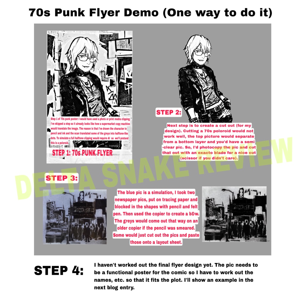
70s Punk Flyer Demo: I’ve put the first three steps (and the text) on a single sheet. That way you don’t have to switch back and forth between the blog and the attached image.


Future Promo Features: Along with updates, I’ll continue the “True Godfathers of Punk” essays but also cover pioneers of post punk, power pop and hardcore as those will be referenced in “The Quitters Book 2: Lost Decade.”


Al Handa 

Sept. 29, 2026


#punk #postpunk #graphicnovel #manga #kindle


Monday, September 21, 2026

Delta Snake Review: 70s Punk Poster and Cover Graphics - Part 1


Delta Snake Review: Sept. 21

70s Punk Poster and Cover Graphics - Part 1

Most late 70s punk posters and covers were essentially collages that looked slapdash but were more creative than it might have looked to the average person. The final work was generally done using a copier but in many cases as a “print ready” layout to a printer.

In other words, these punk posters were created by artists who had the imagination to visualize lo-fi graphic designs (dare I say, “scraped” from ransom notes, collages, pop art, etc) and create print ready layouts for wherever reproduction technology was available (or more specifically, affordable).

I was aware of print ready layouts for the offset printing process because in high school I was the school newspaper editor for two years; which is another way of saying, was like a retail store manager, who was the one willing to stay after school and finish most of the layouts.


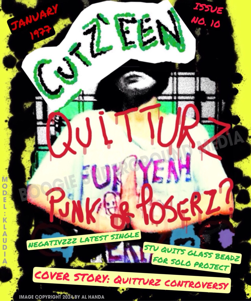
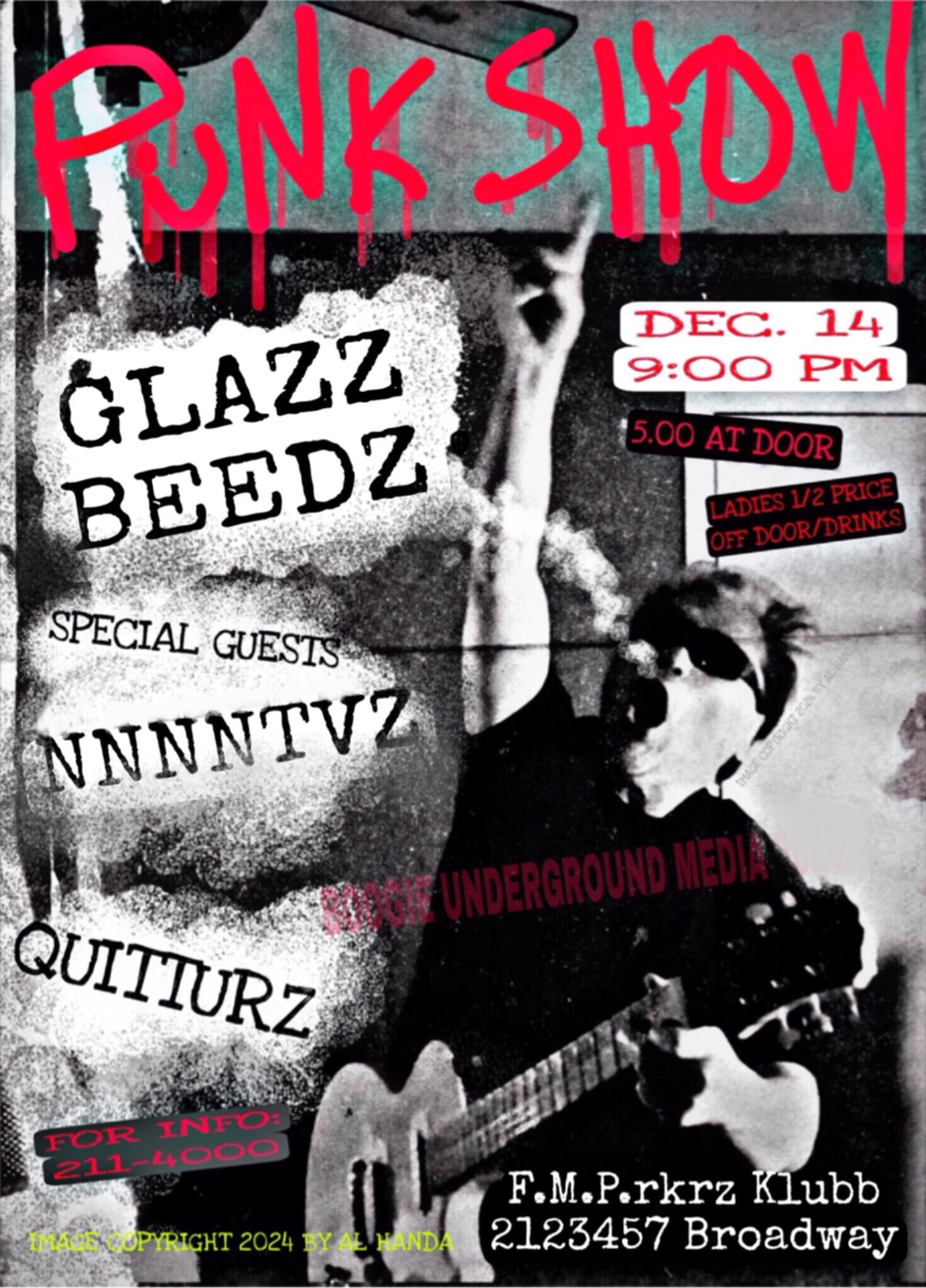
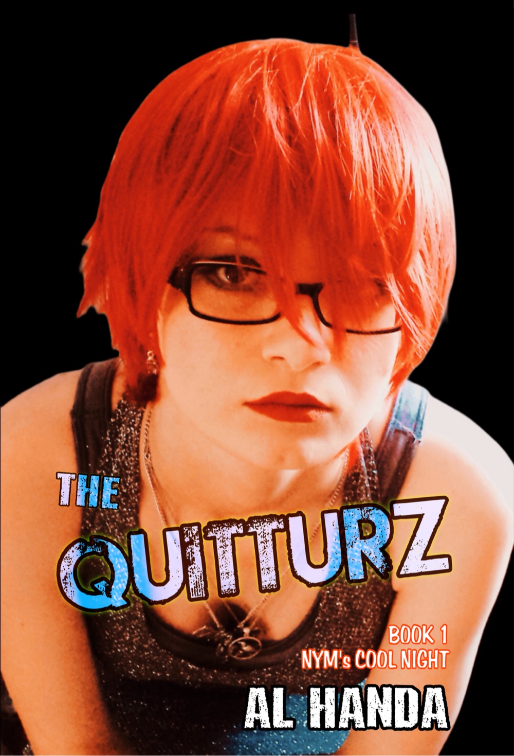
There were fictitious punk magazine covers and concert posters in The Quitturz Book 1: Nym’s Cool Night and although designed on digital programs, I was careful to do it pretty much the same way I would’ve done it in the 70s with a cut and paste style combination of hand drawn, offset and copy machine, lettering, and illustrations.


There are two of the illustrations (in addition to a book promo drawing) and will describe the process which would have been done by hand in the punk era.


The colorful one is probably the least realistic in terms of street art. It’s a magazine cover by a publication that could afford a color cover using offset printing (aka offset lithography) and staff skilled in creating layouts that were “print ready” for the process.


The coloring process would have been more complex; the artist would have used layers like a modern digital application except those would have been tracing paper (or clear film if you were a well off publication) with the entities for each color on its own sheet. In other words, all green shapes in one sheet, red lettering and stuff on another and so on.


That wasn’t hard to do in the 70s because much of the ink work for comic strips and other types of illustrations were done on tracing paper. It was a common skill. 


Somebody, or the artist, would create a pencil sketch, and then another person would come in and put in the ink lines on tracing paper and the additional layers for color, etc. The artist would  often do all these stages, of course, but in big-time strips, there were often people who did the lettering, inking, etc.


The club concert poster was simpler; I simply reproduced a cutout of a photo of a punk rocker (in this case, me) and digitally pasted that into a white sheet and then added the mainly freehand looking lettering.


I took artistic liberty with the top caption which was done in a spray paint font, which I probably would’ve done in a commercial setting if working on a larger commercial poster size layout with an airbrush.


The first Quitturz book has illustrations that are a small historical survey of 70s punk and rock graphics from magazine covers to a fake satirical county fair poster.


In part 2, I’ll show the pieces of a punk poster being made for the graphic novel which I’m actually going to print out and cut and paste together for authenticity (and for fun). I’ll also talk a bit about why punks used the DIY approach.


Al Handa 

Sept. 22, 2026


#punk #graphicnovel #manga #alternative #illustration


Thursday, September 17, 2026

Delta Snake Review: Quitturz webcomic prep

Delta Snake Review: Sept. 16, 2026
Topic: Quitturz webcomic prep


The first dozen or so panels, about four weeks worth, will be a chapter one (I call a grouping of panels a chapter, others might have different nomenclature) that will depict scenes from the first book that cover Nym and Hydie’s early gigs with the Quitturz and their evolution into touring lineup as a trio (a book 2 episode). 

The key thread is the friendship between Nym, the main character and Hydie, the drummer who starts off as a bossy older sister type, becomes the manager of the group and is only constant in an up and down decade. Their relationship has a comical side that many musicians might recognize as a familial dynamic in a new group that evolves into a deeper bond as the events of the decade unfold.

Since the webcomic will open with a group of strips, that allows me to open with a deeper exposition and then the story will settle into three four-panel strips a week (which will be more episodic).

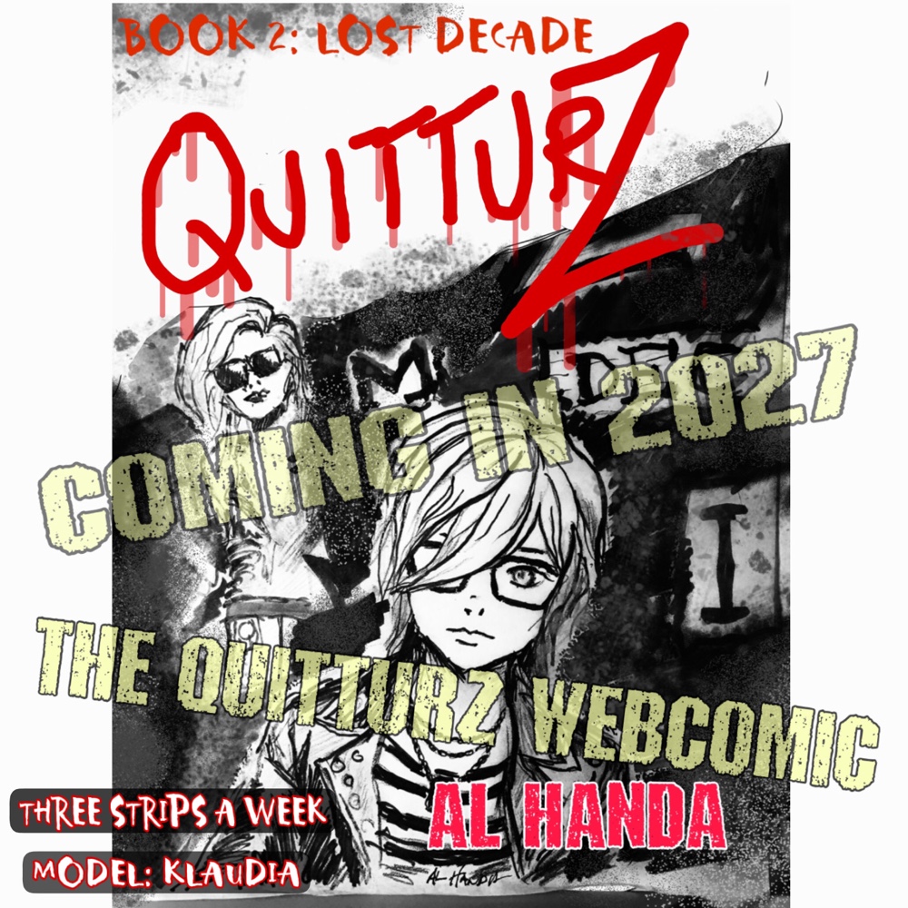
These little posters are good for promo and are part of my preparation. In this case, I needed a slightly younger Nym for the 1977 episodes. These images are going to have cover style detail like with traditional comic books. If you look closely at the faces in this and the previous drawings, you’ll see that I’m using “sketch” type pencil and ink lines, which I’ll start to smooth out (but not too much). 

I’m a fan of 18th century book illustrations and like the rougher lines, plus in this new age of AI, I don’t want too much “polish.” In 1977 punk poster art, there was a lot of longhand and cut and paste, so that’s the look I want to refine into a simpler “longhand” that’ll enable me to draw the same faces a couple hundred of times without burning out. 

I’m about one generation of “face studies” away from freezing the facial features and level of detail and starting work on the panels. The main concession to the times is that the panel lines and text (from the book) will often be added by an app but other than the cleaning up that scanning the drawing will do, I’ll always hand draw the characters and backgrounds (which are simpler in panels). 

My exact process is I start with the eyes; I’ll discard the drawing if the eyes aren’t lifelike. You can create the most detailed professional drawing in the world but if the eyes are off, the whole drawing will look stiff with no sense of life. 

In the case of the image with this blog entry, a sketch was done in pencil, then inked and any unnecessary pencil lines erased. In the 70s, when preparing a “print ready” illustration for offset printing, I’d have erased almost all of the pencil and used old school hatching and dot work for shading or did that on a separate sheet (layer) of tracing paper. 

Modern paint programs are really just a digital version of that old school process of making print ready work so describing that process should be an interesting blog entry in the near future. 

I’m enjoying the process of creating Book 2; it’s a pleasure to tell a story without having to fight autocorrect, etc. It’s just pen to paper like the old days.

Al Handa
Sept. 17

#punk #webcomic #sanfransisco #manga #graphicnovel